Environmental Data Analytics Report
This chapter provides an overview of the environmental data predefined report you can generate in the HPE Networking Apstra Data Center Director GUI. To learn how to generate the report, see Generate Analytics Report.
The environmental data predefined report shows environmental data for all Juniper devices including metrics for power supply, fans and temperature measurement. This report performs historical analytics on data from the Device Environmental Checks Probe.
Device Environment Overview
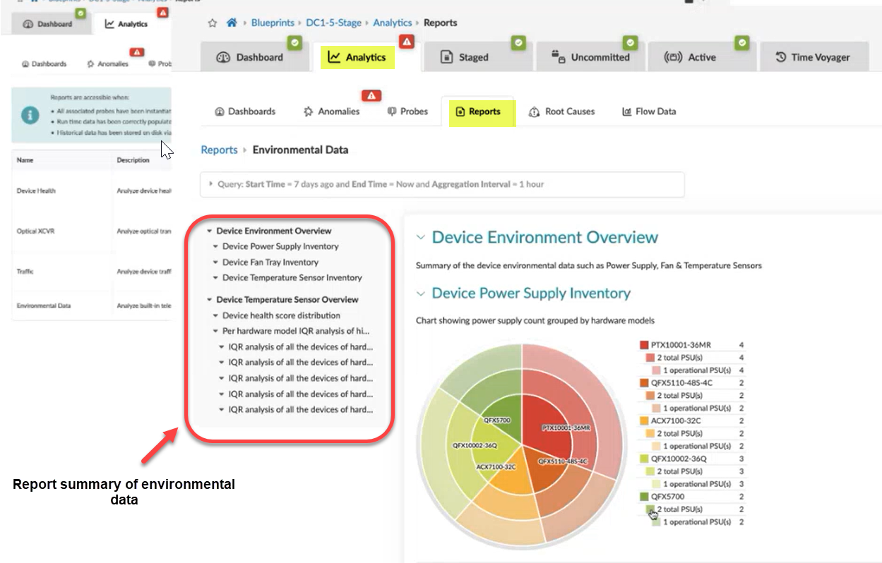
When you generate an environmental data report, the report summary for the environmental data appears. The environmental report summary provides an overview of the device environment (power supply, fan tray, temperature inventory) and the device temperature sensor (device health score and device IQR analysis).
Device Power Supply Inventory
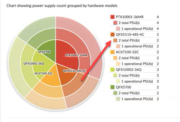
The "Device Power Supply Inventory" subsection shows the number of total and operational power supplies grouped by hardware models. Each color in the chart indicates a different hardware model. As shown in the chart below, the orange slice represents the QFX5110-48S-4C hardware model. In this example, the chart shows two QFX5100's switches, each containing two PSU's (power supply units), however only one PSU is operational.
Device Fan Tray Inventory
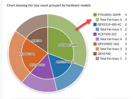
The "Device Fan Tray Inventory" subsection shows the number of fan trays for each hardware model. Each color in the chart indicates a different platform. As shown in the chart below, the green slice represents the PTX10001-36MR router. In this example, the chart shows four PTX10001 routers, each with six fan trays.
Device Temperature Sensor Inventory
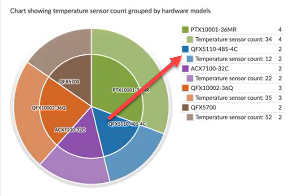
The "Device Temperature Sensory Inventory" subsection shows the temperature sensor counts for each hardware model. As shown in the chart below, the blue slice represents the QFX5110-48S-4C hardware model. In this example, the chart shows two QFX5100's with a total of 12 temperature sensors per switch.
Device Temperature Sensor Overview
The Device Temperature Sensor analyzes the sensors for each hardware model. This overview includes the following sections:
- Device Health Score Distribution
- Per Hardware Model IQR Analysis of Highest Temperature Measured over Time
Device Health Score Distribution
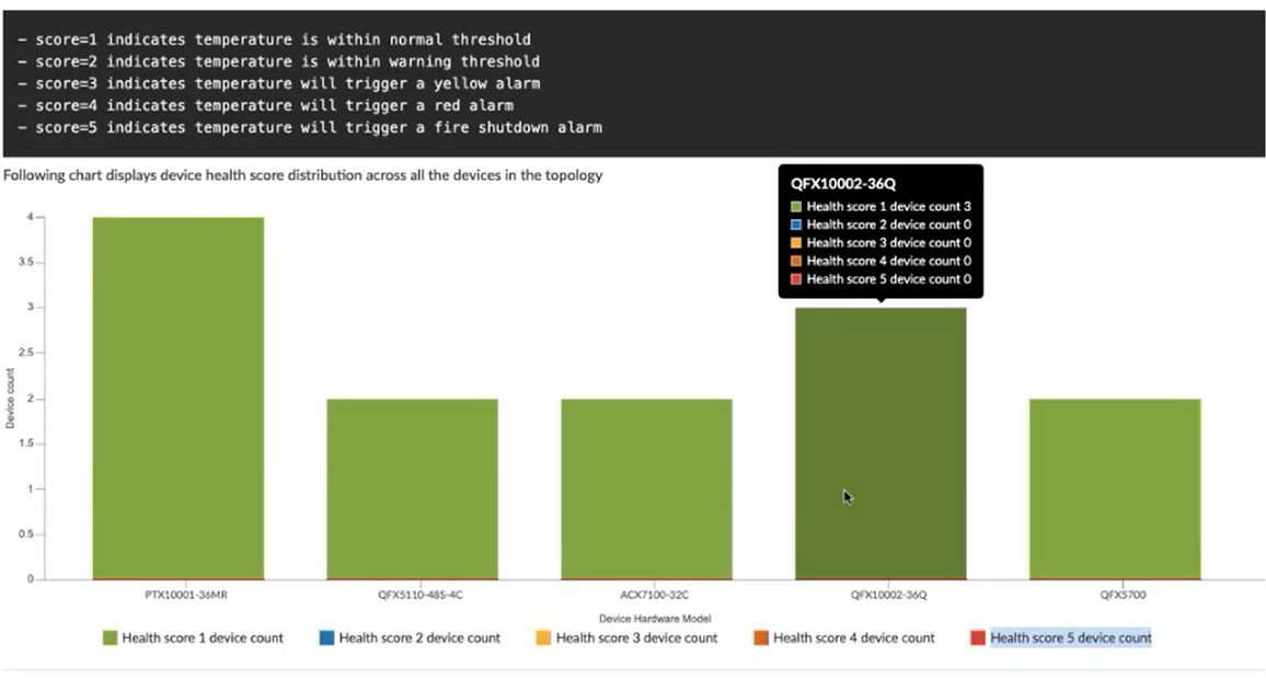
Every Juniper hardware model has pre-calculated temperature threshold values for all temperature sensors on the device. To calculate the device health score, the temperature measurement for each temperature sensor is compared with this pre-calculated threshold value. A temperature health score 1 (best) to 5 (worst) is assigned for all devices based on that comparison.
For example, Figure 5 shows the device health score that is distributed across all the devices in the topology. In this chart, all hardware models are shown as green. When you hover over each model, you can see the health score for each device. In this example, each device is assigned "score=1" indicating that the temperature is within the normal threshold.
If a device is assigned a higher health score (score=3, 4, 5), the temperature sensor triggers an alarm or a shutdown for that device.
Per Hardware Model IQR Analysis of Highest Temperature Measured over Time
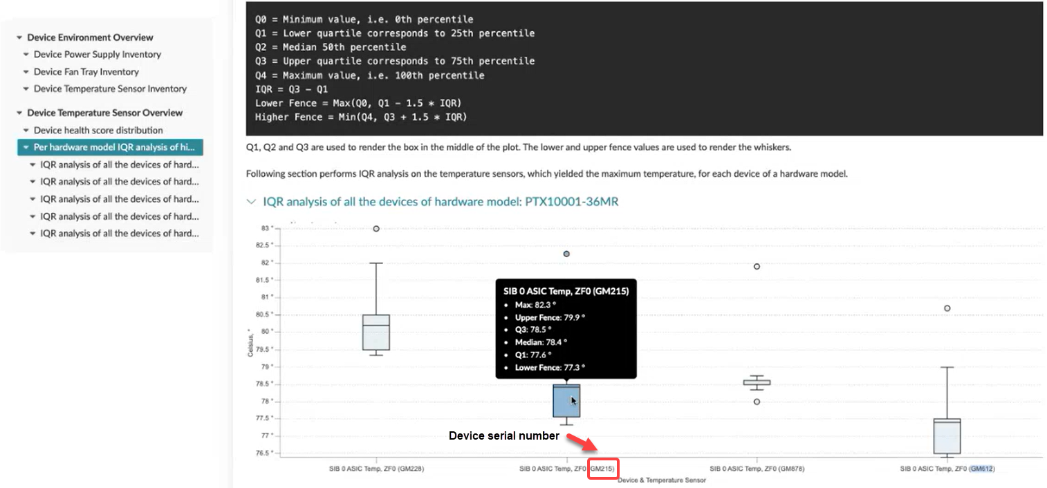
The interquartile range (IQR) is a measure of statistical dispersion, which is the spread of data. An IQR analysis helps identify a normal range of values and how often extreme values are observed. The IQR range is the difference between the upper and lower quartile values in the data. The range is defined as the amount of spread in the middle 50 percent of the dataset.
When you run a report, IQR analysis is performed on the temperature sensors for each hardware model. The figure below shows an example of IQR analysis that was performed on the PTX10001 router. As shown in the following chart, all PTX1000's are identified by their serial number. When you hover over a PTX, you can view the SIB ASIC temperature values for that device.