Traffic Analytics Report
This topic provides an overview of the traffic reports you can generate in the HPE Networking Apstra Data Center Director GUI. The traffic analytics report analyzes device traffic patterns and trends in the data center. To learn how to generate this report, see Generate Analytics Report.
Data Center Overview
This section provides reports on deployed hardware models in the data center. It also shows a chart of traffic rates for server-facing and fabric-facing interfaces on leaf switches.- Device Hardware Model and Operation System Inventory Overview
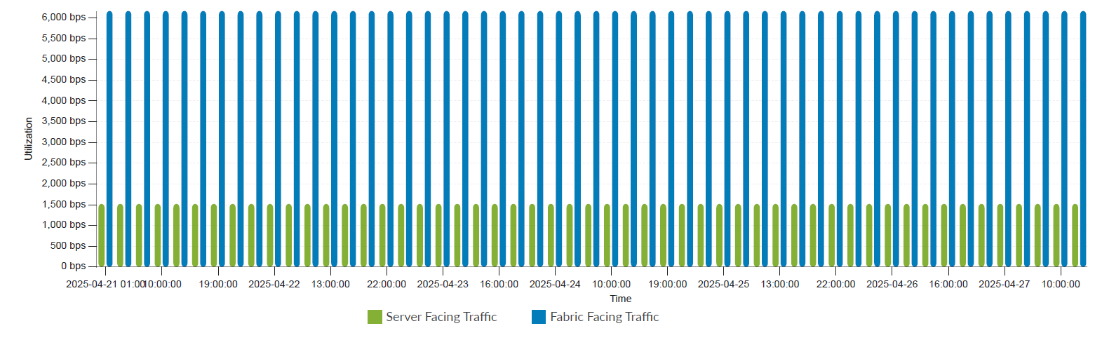
- Aggregated Server-Facing vs. Fabric-Facing Traffic Rate
Device Hardware Model and Operation System Inventory Overview
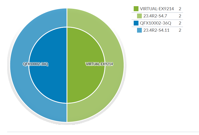
Figure 1 shows a summary of hardware models and corresponding operating systems for all devices deployed in the current data center.
Aggregated Server-Facing vs. Fabric-Facing Traffic Rate
Interfaces on leaf switches can be either server-facing or fabric-facing.
-
Server-facing interfaces connect to anything that's not a spine switch (hardware server, generic system and so on). Server-facing traffic is the sum of both the transmit (TX) and receive (RX) traffic rates for all server-facing interfaces on all leaf switches.
-
Fabric-facing interfaces connect to spine switches. Fabric-facing interfaces connect to spine switches. Fabric-facing traffic is the sum of both TX and RX traffic rates for all spine-facing interfaces on all leaf switches.
Traffic Analysis for Spine Switches
The following section includes detailed analysis of spine switches.
Spine Switch Inventories
The spine switch inventory lists the number of spine devices in the data center. Figure 3 provides details for a each switch, including the switch hardware model, system ID, pod, hardware model, OS type, management IP, and OS version. These details are collected dynamically from the graph and from various device information collectors.

Fabric Utilization Aggregated View
This section shows the aggregated traffic rate, IQR traffic rate, and peak RX utilization for spine switches. Fabric utilization measures bandwidth usage in a switch's internal fabric. This metric indicates data flow efficiency through the switch and its components.
Spine Aggregated Traffic Rate
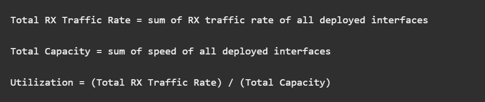
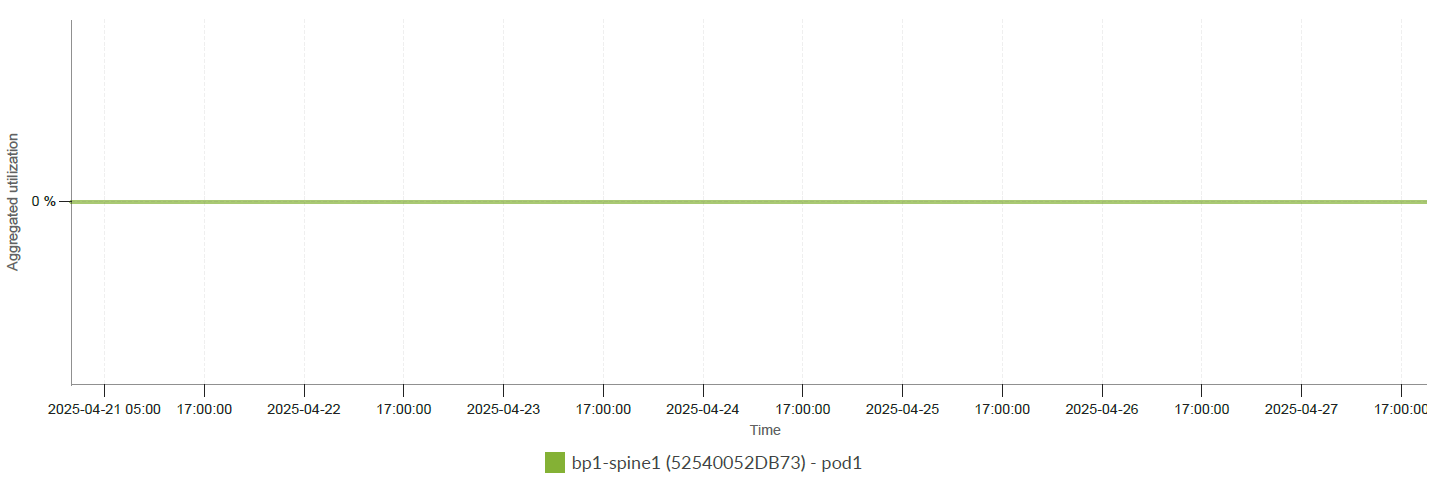
Figure 4 shows the formulas used to calculate the utilization (in percentages) of spine switches. Figure 5 shows a chart of all spine switch utilizations.
Spine Aggregated Utilization IQR
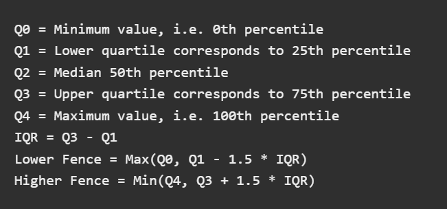
Interquartile range (IQR) measures statistical dispersion (spread of data). Traffic rates vary over time. An IQR analysis helps identify a normal range of values and how often extreme values are observed.
Figure 6 shows the formulas used to calculate IQR-related thresholds. Q1, Q2 and Q3 are used to render the box in the middle of the plot. The lower and upper fence values are used to render the whiskers.
Figure 7 shows the traffic rate IQR for all spine switches during the query time window.
Spine Peak RX/TX Utilization
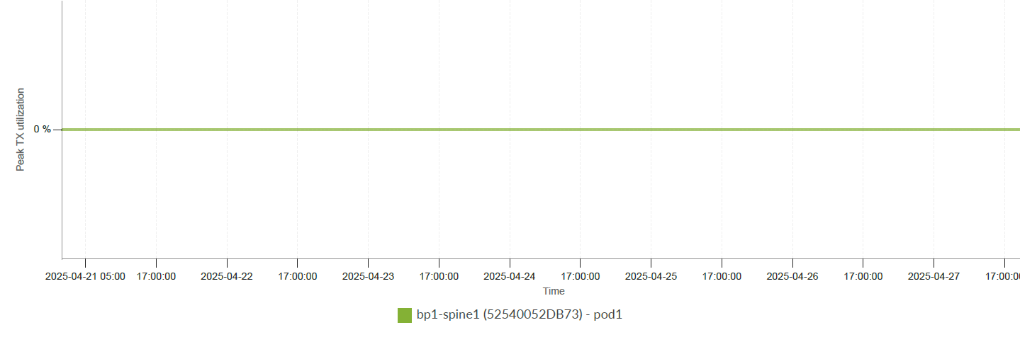
Bursty traffic can cause issues even when the average traffic rate is acceptable. Peak RX/TX traffic rates are monitored on all deployed switch interfaces during each aggregation period.
- Spine Peak RX Traffic Rate
- Spine Peak Interface RX Utilization IQR
- Spine Peak TX Utilization
- Spine Peak Interface TX Utilization IQR
Spine Peak RX Traffic Rate
Figure 8 compares peak RX traffic rates observed on all spine switches during the query time window.
Spine Peak Interface RX Utilization IQR
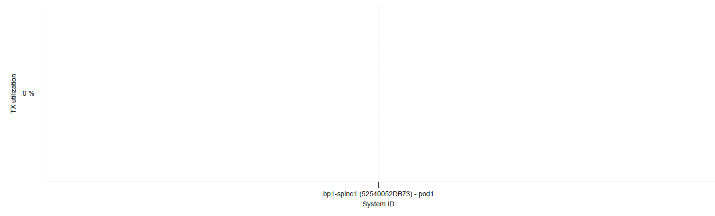
The following chart shows the peak interface RX traffic rate IQR for all spine switches.

Spine Peak TX Utilization
The following chart shows the peak interface TX traffic rate for all spine switches.
Spine Peak Interface TX Utilization IQR
The following chart shows the peak interface TX traffic rate IQR for all spine switches.
Fabric Utilization Individualized View
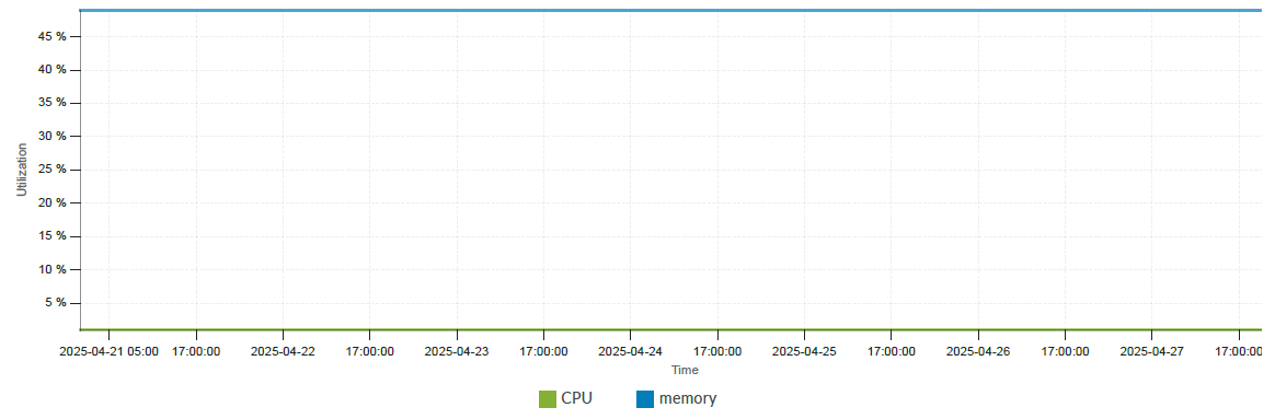
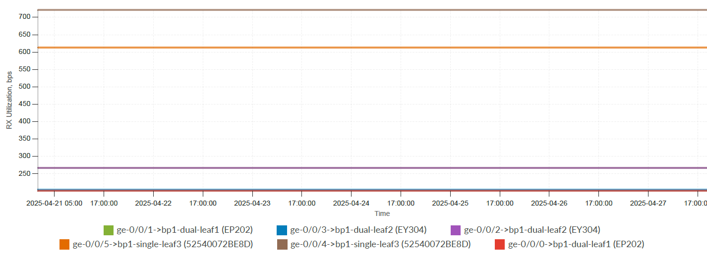
You can also view reports that show detailed traffic analysis examples for each individual spine switch. The reports include examples of fabric utilization trends, CPU and memory usage, and RX/TX utilizations as shown in the following charts.