Device Health Analytics Report
This topic provides an overview of the device health reports you can generate in the HPE Networking Apstra Data Center Director GUI. To learn how to generate this report, see Generate Analytics Report.
The Device Health report analyzes the health of the device. In this report, you can view the health of all managed devices in your network.
Inventory Overview
The Inventory Overview (Figure 1) shows the number of managed devices in your network. This report shows the device hardware model, system ID, label, network operating system (NOS), average/max memory usage, and average/max CPU usage.

Memory Usage Analysis
The Memory Usage Analysis reports show detailed memory usage for all devices and includes charts used to identify memory leaks. These reports are useful for capacity planning and identifying usage patterns to predict demand.
It can be normal for a device to use more memory over time due to increased workload or new features being enabled, however it might also suggest memory leaks.
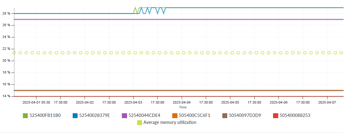
Device Memory Usage
The Device Memory Usage chart (Figure 2) shows the top 10 devices with the highest memory usage over time.
Memory Trending Charts
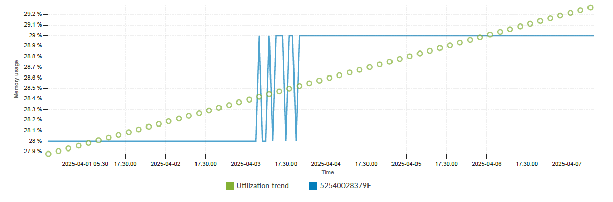
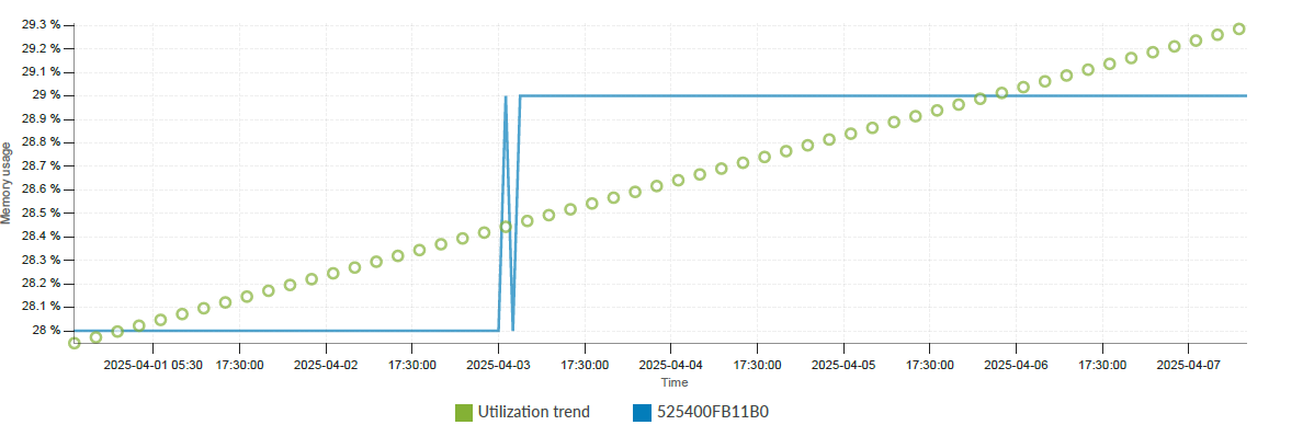
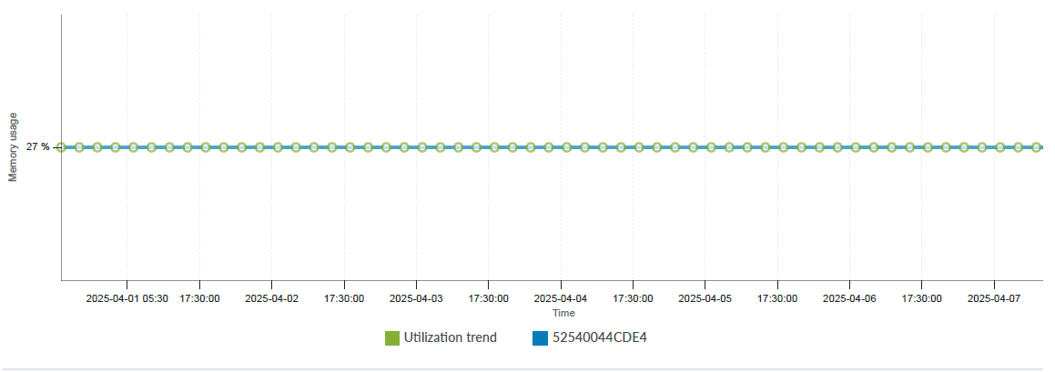
The Memory Trending charts show devices with the highest memory increments rate. A device might use more memory over time due to increased workload or new features.
For example, consider three devices. Device A's memory usage increases 5-fold from 10M to 50M. Device B's usage increases 10 percent from 100M to 110M. Device C's memory usage decreases from 500M to 490M. Accordingly, we rank device A before Device B and eliminate Device C.
The following examples show the memory trending charts for two leaf devices and one spine device.
CPU Usage Analysis
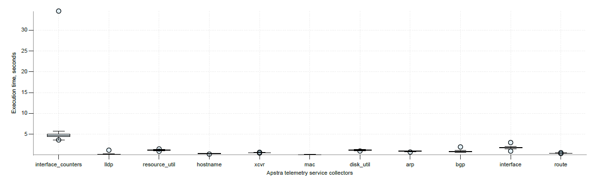
The CPU analysis section provides on-device CPU usage and telemetry collectors for each device.
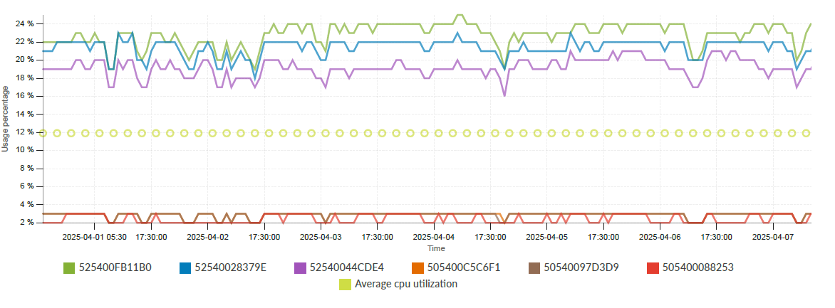
Device CPU Usage
The Device CPU usage chart displays the CPU usage for all your devices.
Device CPU Usage Analysis
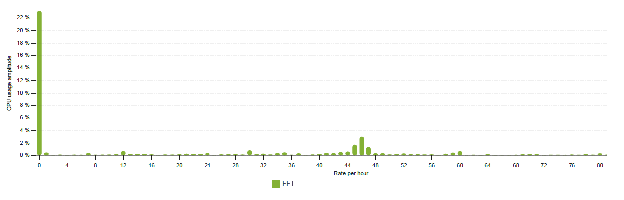
The measurement of some metrics, such as CPU usage, might exhibit periodical behaviors due to certain operations repeated at fixed intervals. For example, device telemetry collectors may issue CLI commands to collect traffic counters every few seconds, causing device CPU usage to increase. We use FFT (Fast Fourier Transformation) to convert a time domain measurement to the frequency domain. This helps identify associations between various frequencies and known periodical operations.
For example, in the frequency domain chart (Figure 7) for a leaf device, the x-axis represents frequency in number per hour. Value 0 means a constant signal, while value 120 means the signal repeats 120 times per hour, with a 30-second period.