Neighbors View (Active)
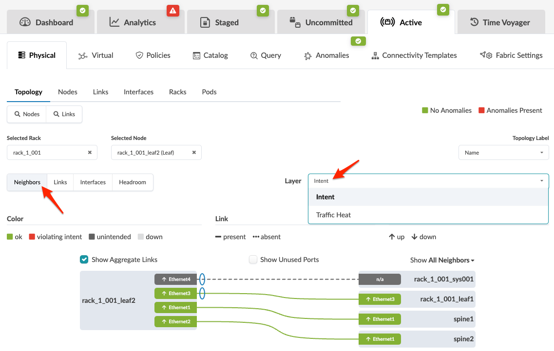
- To show aggregate links, click the Show Aggregate Links check box.
- To show unused ports, click the Show Unused Ports check box.
- To show a different label (name, hostname, S/N), select a different label from the Topology Label drop-down list (right side).
- To show a different layer, select a different layer from the Layer drop-down list.
- Choose to show all neighbors or only specific ones (generic, leaf, spine, and so on).
The traffic heat layer is shown below. The colors represent different available/used capacity based on the current system level TX/RX, averaged to 2 minutes, by default. If the aggregated TX or RX across all the device interfaces is < 20% it's green . If it's between 21-40%, it's yellow and so on. For each 20% difference, capacity is shown with a different color. (Server color is calculated based on the interface counters of the leaf ports facing that server. To see RX/TX per interface for a single node, click the node.
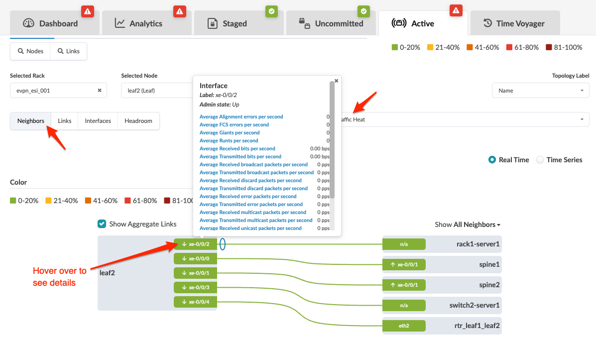
If any of a device's deployed ports are > 81% of its capacity in either RX or TX, a new "Alert" icon is shown on the device. (The screenshot below is for HPE Networking Apstra Data Center Director version 4.2.0, which may be slightly different from newer versions.)

Hovering over a node shows exact aggregated values.
