GPU NIC Analytics Dashboard

Introduction

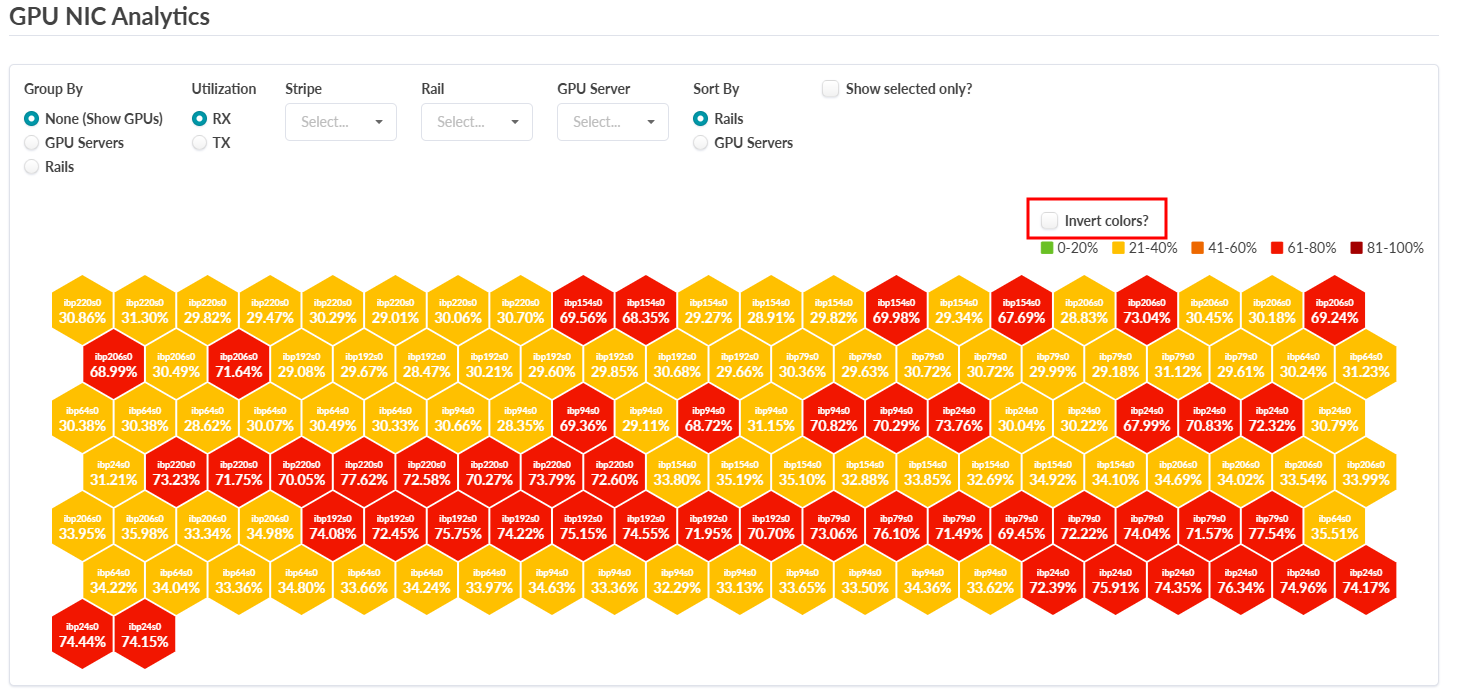
Version 6.0 introduces the GPU NIC Analytics Dashboard. This dashboard is designed to monitor and visualize GPU network utilization across AI fabrics. The dashboard provides a heatmap-style view of transmitted (Tx) and received (Rx) traffic per GPU NIC, enabling you to visualize GPU traffic patterns and optimize GPU network performance.

GPU NIC Analytics Dashboard Overview
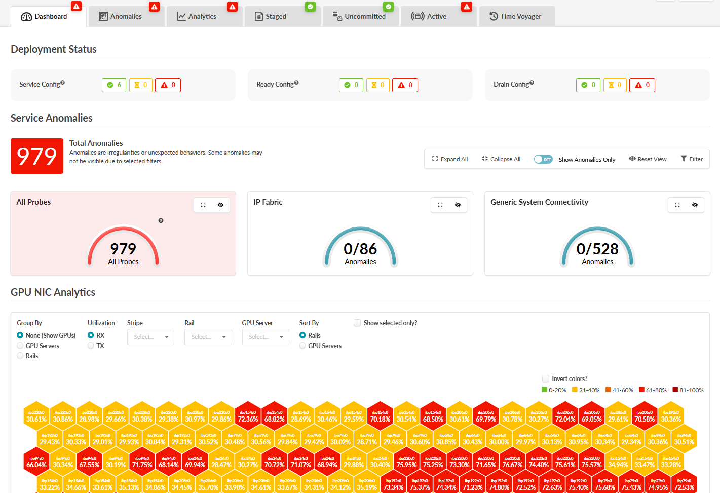
The GPU NIC Analytics Dashboard displays in the main blueprint dashboard page for Rail-Optimized or Rail- Collapsed configurations. The dashboard provides an intuitive way to monitor GPU network activity.

Dashboard interface showing system analytics and anomalies; tabs for navigation, deployment status indicators, service anomaly counts, and GPU NIC analytics with color-coded performance metrics.

The dashboard also offers the following features:

Heatmap Visualization: A honeycomb heatmap represents GPU NIC utilization. Color-coded hexagons indicate the following traffic levels:

  • Green (0-20%)

  • Yellow (21-40%)

  • Orange (41-60%)

  • Red (61-80%)

  • Dark Red (81-100%)

Starting in 6.2, you can invert the colors of the dashboard. With the Invert colos option selected, Green indicates full usage and Red indicates low usage.

GPU NIC Analytics dashboard showing GPU utilization in a hexagonal grid. Hexagons are color-coded from green to dark red based on utilization percentages, with RX and TX metrics displayed.

Traffic Statistics: View Tx and Rx traffic metrics for the entire fabric or drill down into specific components. You can filter traffic by:
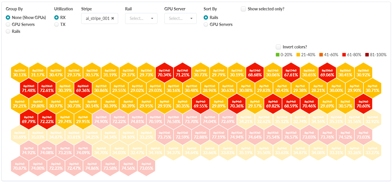
Stripe

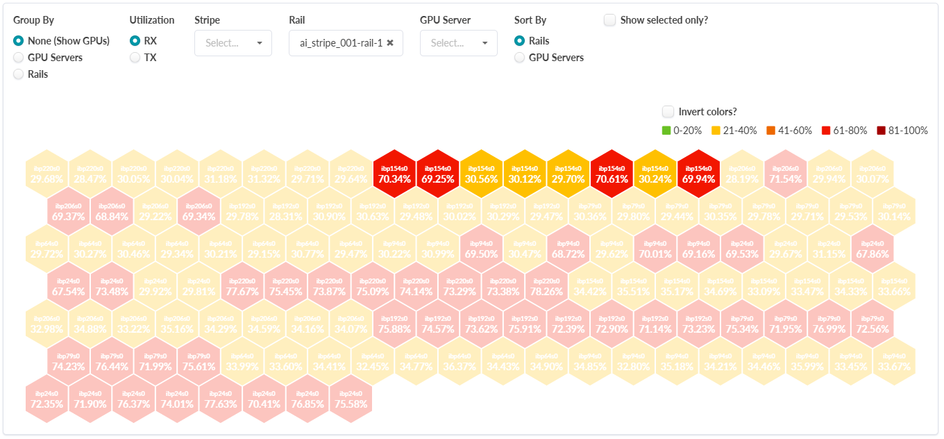
GPU utilization visualization with hexagonal tiles labeled by identifier and percentage. Tiles color-coded from green for low usage to dark red for high usage. Options to group, sort, filter by utilization type, stripes, rails, or GPU servers. Color inversion option available but not active.
Rail

GPU utilization data visualized with hexagonal grid; hexagons show utilization percentages with color coding: green for low, yellow for moderate, orange for high, red for very high, dark red for maximum utilization.
GPU Server

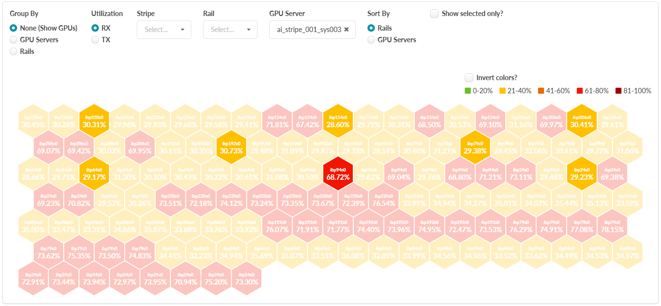
GPU utilization visualization with hexagonal grid color-coded by usage levels: green for low, yellow for moderate, orange for high, red for very high, and dark red for maximum. Each hexagon shows GPU identifier and utilization percentage. Filters and sorting options available for grouping and customizing the view.

You can also view and filter aggregated traffic for GPU servers and rails.

In the image above, for the Utilization option, RX is selected for the GPU Server "ai_stripe_001_sys001". For the Sort By option, GPU Servers is selected. This displays RX traffic for all of the GPUs in the selected GPU Server.
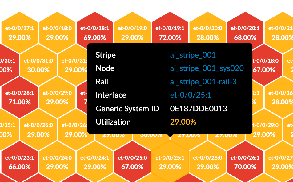
Click on a hexagon for additional details on specific GPUs or NICs. Note that each detail here is hyperlinked; click to navigate to a page with further details for each item.

Hexagonal chart showing system utilization. Color-coded hexagons indicate utilization from yellow to red. Tooltip details component ai_stripe_001 et-0/0/25:1 with 29 percent utilization.