Blueprints Dashboard
Blueprint dashboards show the overall health and status of your network.
To go to a blueprint dashboard from the GUI:
From the left navigation menu, click Blueprint, then click the name of the blueprint.
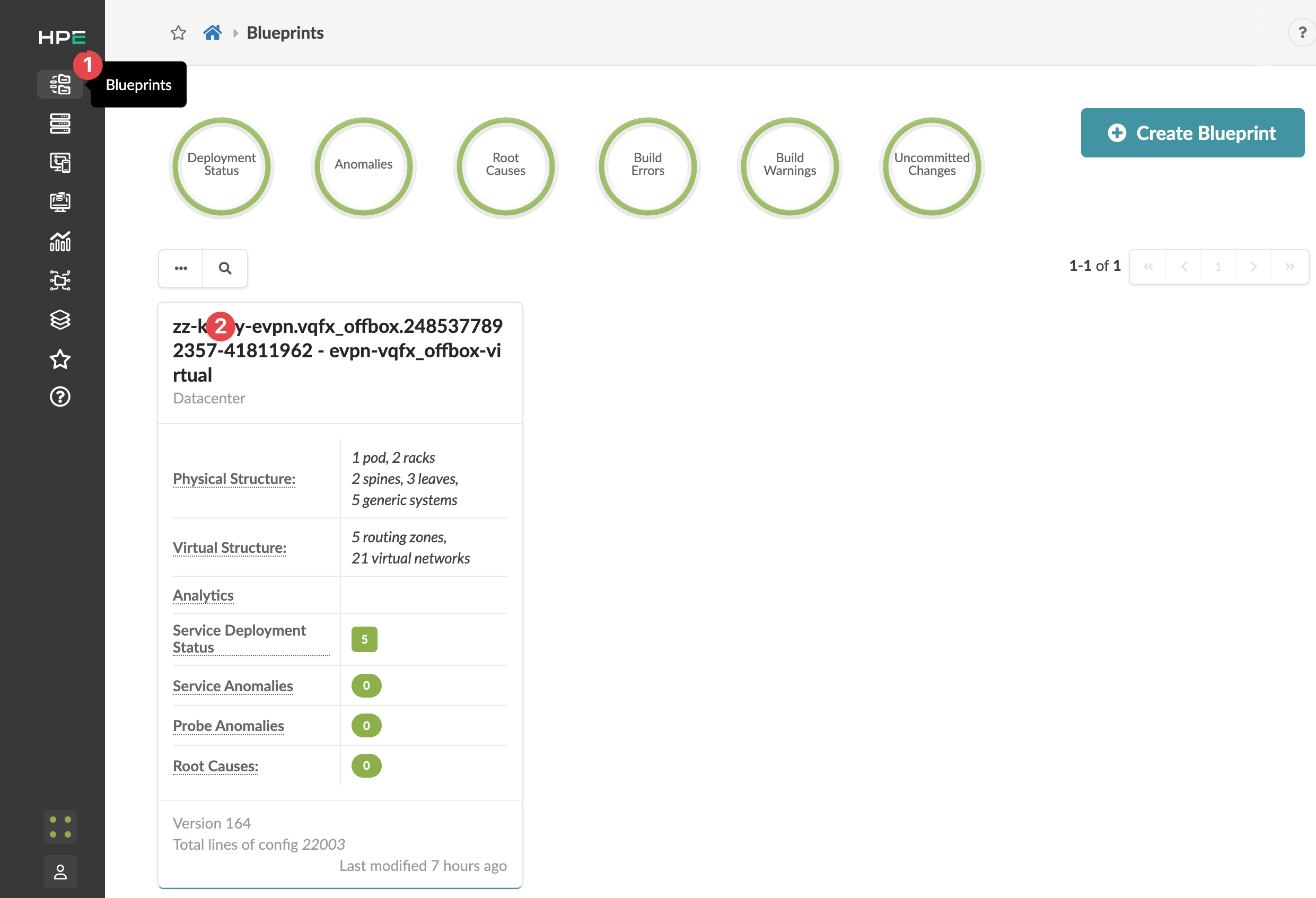
The Blueprint dashboard appears.
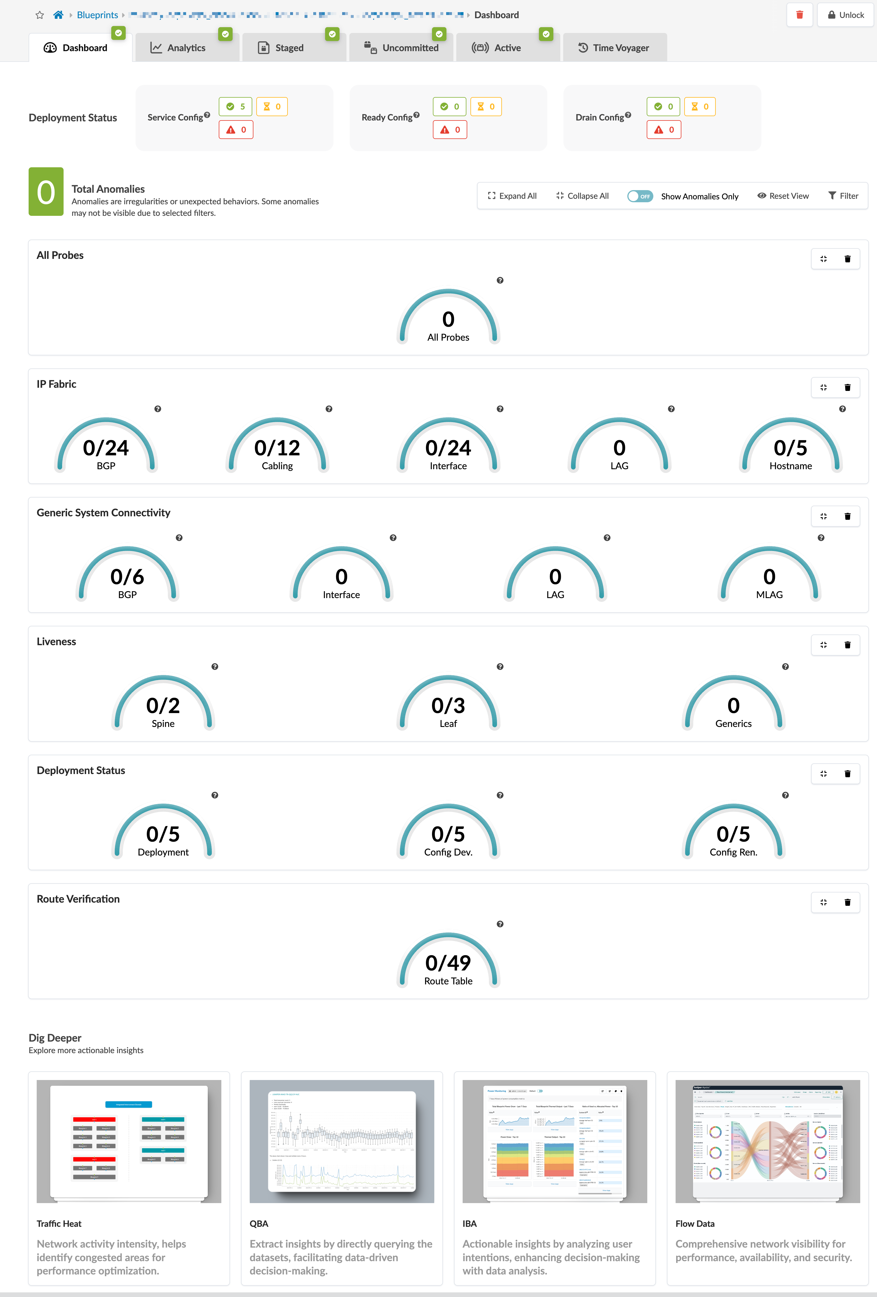
The dashboard shows the overall health and status of a blueprint. Statuses are indicated by color: green for changes that succeeded, yellow for changes that are in progress, and red for changes that failed. The deployment status section includes statuses for service configuration, ready configuration, and drain configuration. The anomalies section includes statuses for all probes, IP fabric, generic system connectivity, liveness, deployment status, route verification, leaf peering, and more. Click an indicator to go to more details.
You can display analytics dashboards on the blueprint dashboard to have additional network information on one screen. To add them, navigate to Analytics > Dashboards and turn ON the analytics dashboards' default toggle.
The bottom of the dashboard includes links to areas of the blueprint you can use for monitoring and analysis.
GPU NIC Analytics Honeycomb Dashboard
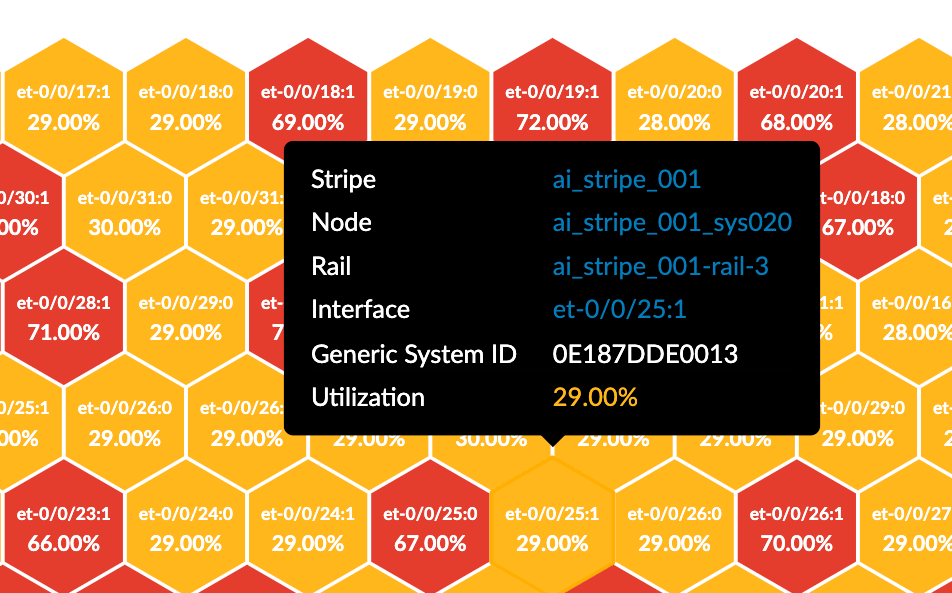
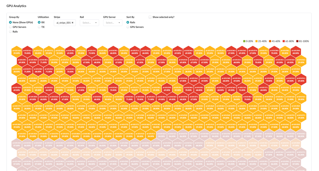
Version 6.0 introduces the GPU Analytics Honeycomb Dashboard. This dashboard is designed to monitor and visualize GPU network utilization across AI fabrics. The dashboard provides a heatmap-style view of transmitted (Tx) and received (Rx) traffic per GPU NIC, enabling you to visualize GPU traffic patterns and optimize GPU network performance.
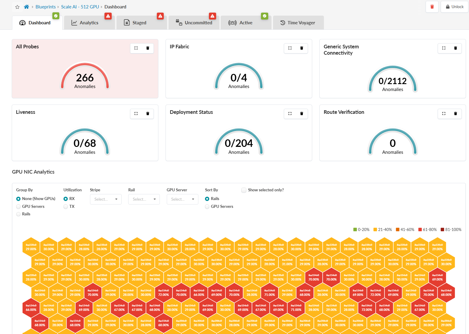
The dashboard also offers the following features:
Heatmap Visualization: A honeycomb heatmap represents GPU NIC utilization. Color-coded hexagons indicate traffic levels:
-
Green (0-20%)
-
Yellow (21-40%)
-
Orange (41-60%)
-
Red (61-80%)
-
Dark Red (81-100%)
Traffic Statistics: View Tx and Rx traffic metrics for the entire fabric or drill down into specific components. You can filter traffic by:
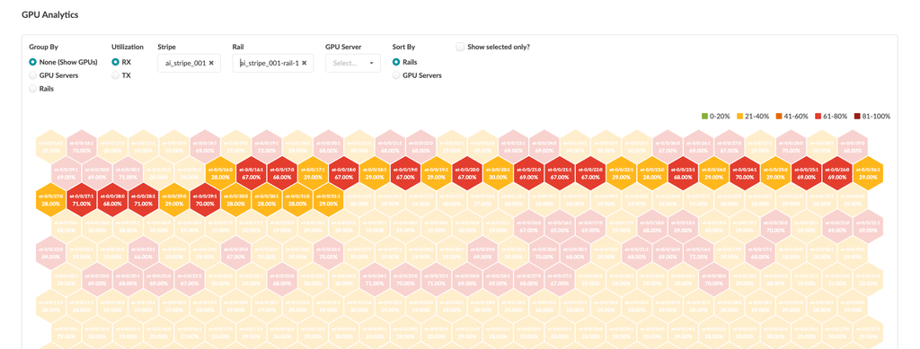
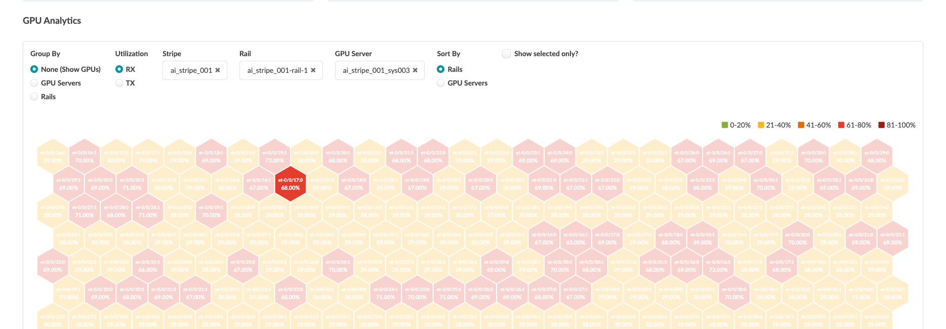
You can also view and filter aggregated traffic for GPU servers and rails.