HPE Networking Apstra Data Center Director Flow Dashboards
The following sections show examples of use cases using the Apstra DC Director Flow dashboards used to manage your network.
To access the Apstra DC Director Flow dashboard, from the GUI, select Analytics > Flow Data > Flow Collector. Click Link to dashboard to link directly to the Flow dashboard. For information about launching the dashboard from your browser, see the Juniper Apstra Flow Installation and Upgrade Guide.
Top-N Dashboard
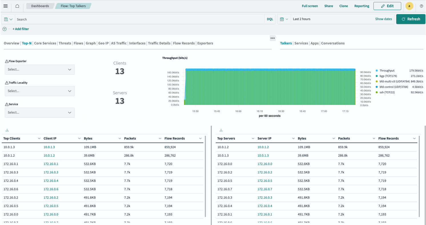
Understanding and optimizing network performance is critical for any network operator. Apstra DC Director Flow lets you continuously learn about what is traversing your network at any given time and helps you continually improve network functionality. The Top-N Dashboard (Figure 1) shows an example of which hosts are most active on your network. You can filter this traffic by talkers (traffic source and destination) and services such as SSH and HTTPS, Apps, and Conversations. You can also add filters to further enrich the data shown. For example, you might want to narrow in on a particular source or destination, service, or TCP flags to only show the connection status.
Threats Dashboard
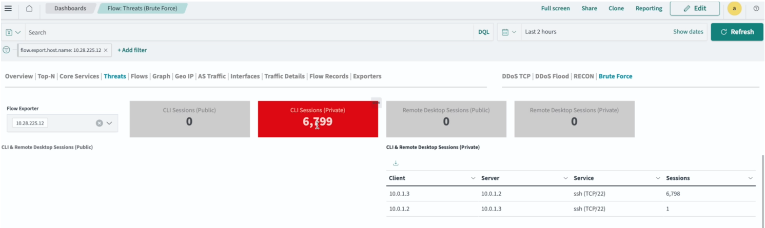
Apstra DC Director Flow can perform basic threat detection for flows. The Threats dashboard shows any DDoS, port scans, and brute force attempts on your network. The following example (Figure 2) shows the number of repeated SSH sessions that were sent between hosts in the network. Apstra DC Director Flow displays these sessions as brute-force attempts.
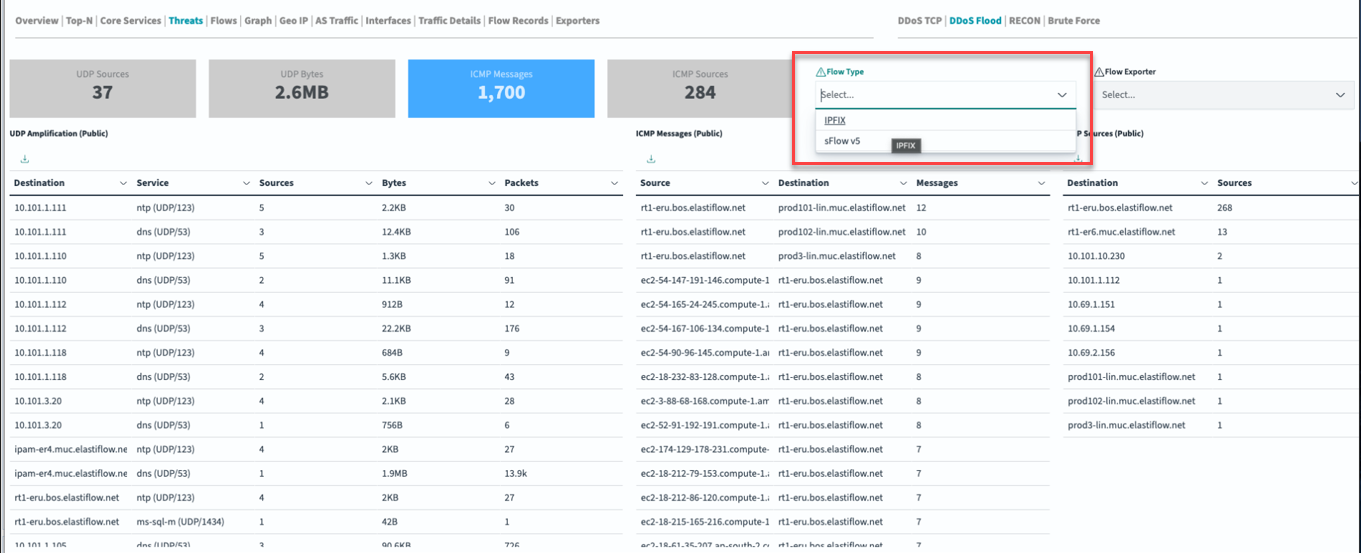
You can configure the threats dashboard to specify the type of flow information you want to monitor, either IPFIX or sFlow v5 (Figure 3).
Apstra Flow allows you to trigger the flow results yourself by using the open-source Hping3 network scanning tool. This tool can be used to send different packet types for security vulnerability testing.
Performance and Planning Dashboards
Gaining inside knowledge into your network can help you rebalance your applications and capacity planning, but to do that, you need to see how the flows are impacting individual interfaces. To see a particular traffic flow in the GUI, you can create a filter that persists across the top-level tabs in the Apstra DC Director Flow dashboard.
For example, from the Flow: Top Talkers tab (Figure 4), we chose the most talkative source IP (src) address (indicated by arrow 1). By hovering over that IP and clicking the + sign, we created a filter (indicated by arrow 2).
This filter also applies to other tabs, such as the Interface tab shown in Figure 5. This tab shows the interfaces on which your chosen IP address communicates.
From the Interfaces dashboard, you can:
- Identify link saturation: See which interfaces are experiencing high traffic volume, helping you determine where to rebalance applications or add capacity.
- Drill down further: Select individual flow exporters (switches), interface types (ingress/egress), and specific interfaces for even more granular analysis.
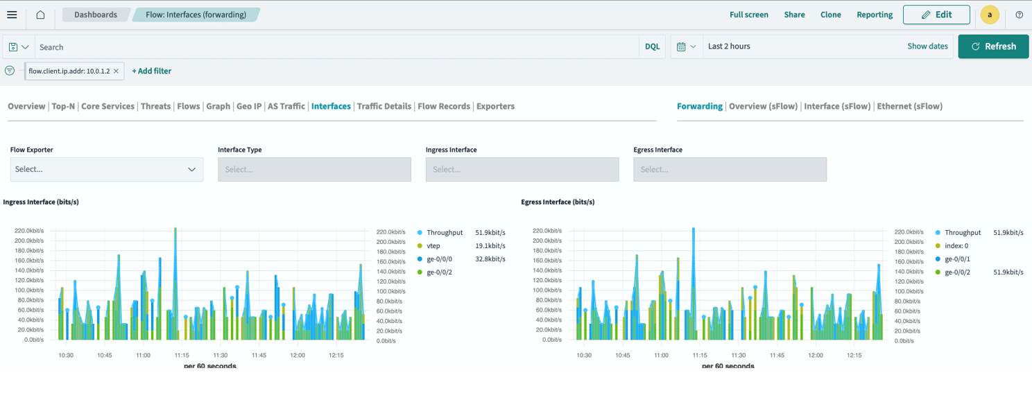
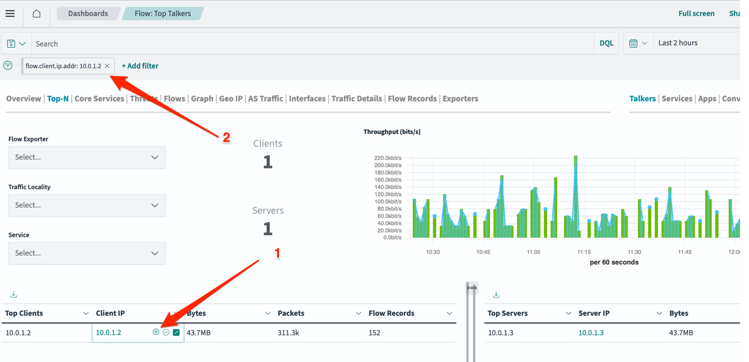
This use case shows you where you are having issues with link saturation in your network. This is useful for capacity planning exercises, or troubleshooting cloud-native applications in a data center.
Client/Server Dashboard (Chord View)
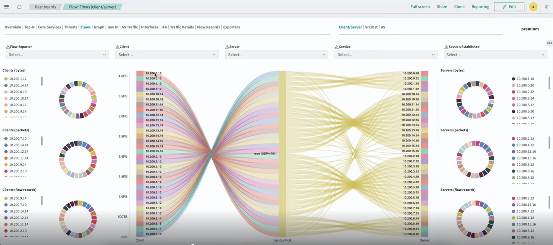
The Chord View visualizes data transfer relationships between endpoints. In AI workloads, it shows the data path of collectives across rings and tree views. For example:
-
All-Reduce displays relationships based on GPU rank.
-
All-to-All uses a logical spray.
The rail traffic illustration in Figure 6 highlights the IP addresses where traffic flows occur. Flow width indicates traffic volume.
-
Wider flows signify higher traffic.
-
Narrower flows indicate lower traffic.
Arrows show traffic direction between locations. You can filter traffic based on any IP address to view specific flows.
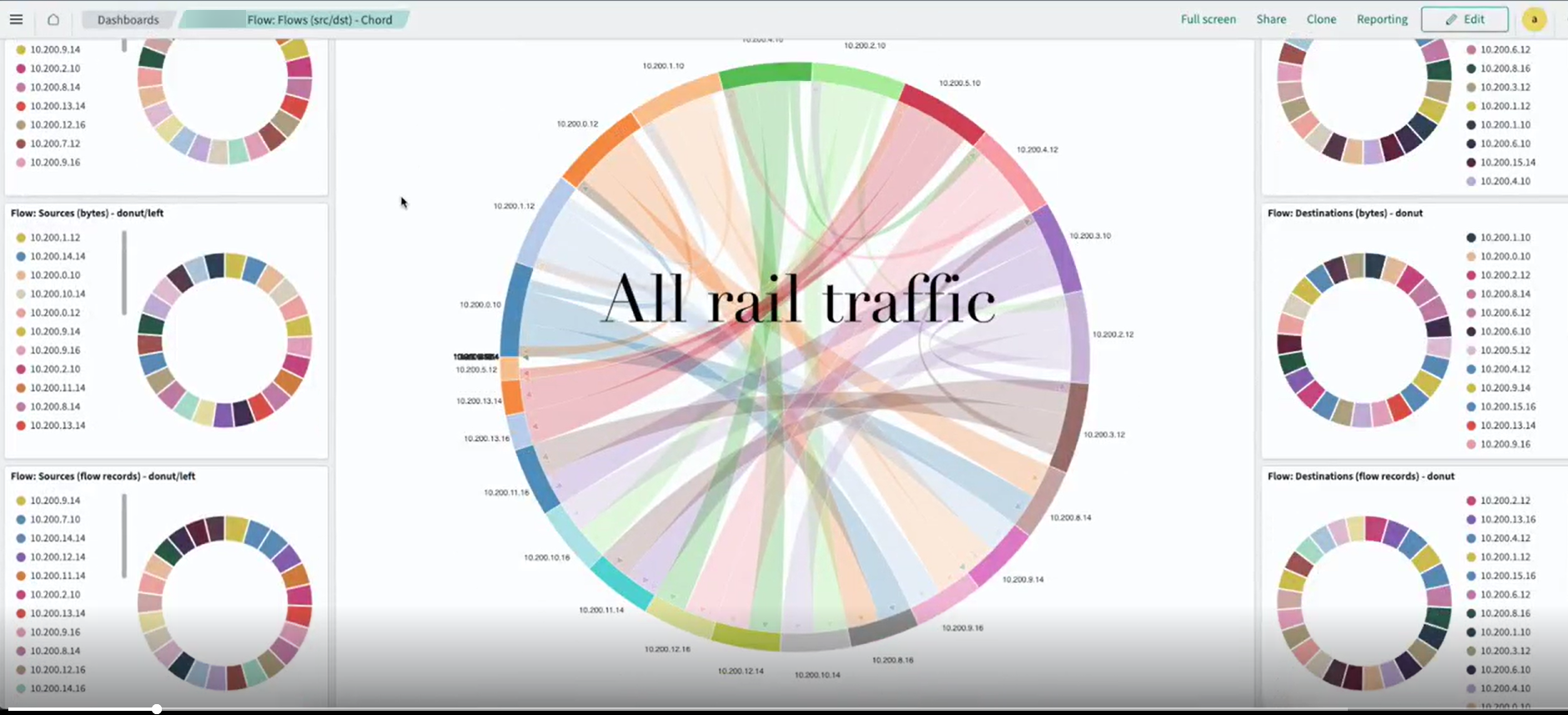
Click the Flows tab to explore the various traffic filtering options.